Client: Rohit Springforms Pvt. Ltd, Bhosari, Pune, India


Client: Sujay Ventures

Client: Avishkar Realty

Logo Philosophy of Avishkar RealtyAvishkar is the invention that redefines itself with every creation, and presents a better avatar with every new offering. The concentric circles show an evolving sphere that imbibes new ideas and features and grows with time. The orange hues denote the vibrancy of this brand, with the will to dynamically embrace market changes and spur innovation. The shading of the same color in each circle denotes the integration of various types of effort needed to produce a unique creation. The overall effect of a ball of fire denotes a brightly shining sun with the promise of eternal sunshine.
Client: The Reading Habit

Logo Philosophy of The Reading Habit
Client: Reelicon Shelters Pvt. Ltd.
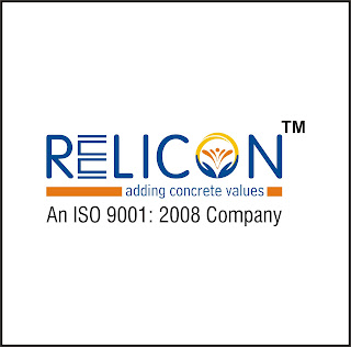
Logo Philosophy of Reelicon Shelters Pvt. Ltd.


Client: Indus Business School


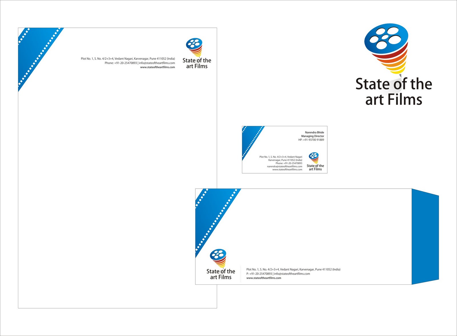
Client: State-of-the-Art-Films
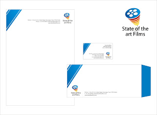
Logo Philosophy of State-of-the-Art-Films
Client: Saturn Oranet

Client: Gund & Pethe Associates

Logo Philosophy of Gund and Pethe Associates
Client: Mega Corporation


Client: Sujay Ventures

Logo Philosophy of Sujay Ventures
Sujay Ventures embodies everything that is pleasant and desirable on this earth. Two palms coming together to form a chalice signifies a cradle that holds the world. The vision of mother earth balanced on top of the chalice denotes the delicate balance of aesthetics, eco friendly features and technology that is the cornerstone of any project undertaken by Sujay ventures. The blue and green colors stem from the same palette and show a fusion of elements. The blue denotes luxury as well as the serenity of the vast skies and water bodies. The green stands for vitality and the bounties of the earth and the environment. The logo of SUjay Ventures very simply portrays the values it is built on.
Client: Avishkar Realty

Logo Philosophy of Avishkar RealtyAvishkar is the invention that redefines itself with every creation, and presents a better avatar with every new offering. The concentric circles show an evolving sphere that imbibes new ideas and features and grows with time. The orange hues denote the vibrancy of this brand, with the will to dynamically embrace market changes and spur innovation. The shading of the same color in each circle denotes the integration of various types of effort needed to produce a unique creation. The overall effect of a ball of fire denotes a brightly shining sun with the promise of eternal sunshine.
Client: The Reading Habit

Logo Philosophy of The Reading Habit
The Reading Habit is your sanctum away from the hustle bustle. You can lose yourself in the many books, or listen to some soothing music, or relax and chat over a cup of coffee. All these elements are portrayed in the logo. The overlapping rectangles represent books, and the coffee cup and sound note are also self explanatory. The burnt sienna color exudes warmth, and is suggestive of the environment offered in this place. The logo wins points for simplicity and its obvious pictorial elements embed themselves in the reader's mind creating strong memories of this place and what it denotes. The logo promises to create long lasting brand equity for anyone who is into books, music or coffee, thus firmly positioning the company in their target demographic.
Client: Reelicon Shelters Pvt. Ltd.

Logo Philosophy of Reelicon Shelters Pvt. Ltd.
Reelicon stands for reliable construction - a quality which is aptly portrayed in their logo. The O in the logo is symbolic consisting of two palms held together giving rise to a spurting fountain. The palms are all encompassing representing the wide cross-section of society served by the company. The fountain symbolises joy, prosperity and vitality reflected in the group's many ventures. The orange color of the fountain represents the positive aura brought about by Reelicon Shelters. The overlapping golden arc represents the vibrancy, enthusiasm and positive energy inherent in all Reelicon ventures. The blue color used for lettering denotes the solid foundation of this group and the trust they have gained over the years.
The Reelicon group is on a path of constant evolution, dedicated service and commitment to its customer base and this is embodied in the logo.
Client: Parge Builders


Logo Philosophy of Parge Builders
Parge Builders intend to provide the best housing and workplace solutions to their prospective clients on an honest footing. The logo is inspired from the weaver bird that puts in a lot of honest labor in shaping its nest. The logo colors reflect their affinity and respect for nature and convey a desire to be in harmony with the surroundings even while pursuing growth. The pair of birds approaching the nest represents potential customers who will utilize these spaces crafted for them with the utmost care and love.
The colors used reflect the following:
The marshy green color portrays an environment friendly approach and a promise of tranquil spaces from Parge Builders. The yellow color portrays a cheerful and positive attitude for life and its pairing with blue signifies the dignity and trustworthiness of relations that will grow over time.
Client: Indus Business School
Logo Philosophy of IBS (Indus Business School)
The three circles denote the three main entities this logo embodies – the student body which is the life blood of our institution, the faculty which provides the fountainhead of knowledge necessary to nurture the students, and the industry or corporate nexus which is essential for professional success. The circular arc is the global arena in which we position ourselves, and the context in which we need to compete. Orange represents our ethical approach and purity of thought coupled with the drive needed to leave no stone unturned. Blue represents the vastness of the sky and the limitless opportunities we provide our students. Green represents the growth and affluence that is sure to come to everyone who passes our hallowed doors.

Client: State-of-the-Art-Films
Logo Philosophy of State-of-the-Art-Films
The logo for State of the art films is a ‘Spinning Top’ symbolizing the dynamic nature of the film industry. How the top spins and to what length of time it spins depends on the way it is thrown very similar to the fate of any production depending on its inputs. The tropical color scheme coupled with blue portrays the passion of the team along with professionalism expected from every member. Various sections or layers depict different aspects of film making such as editing, cinematography, music composing etc. The ‘in motion’ aspect denotes the fast pace and transient nature of the film industry and the constant efforts needed to maintain that pace.
Client: Saturn Oranet

Client: Gund & Pethe Associates

Logo Philosophy of Gund and Pethe Associates
Gund and Pethe Associates are a partnership firm succeeding on synergies of both the parties involved. Gund and Pethe stand for traditional time honored values and a glowing sun is used to portray the radiance reflected in anything they undertake. The numerous rays of the sun indicate the minutest detail that is paid attention to by the company in order to deliver a first rate product. The golden yellow color reflects the positive aspects and auspicious outcomes of their undertakings. It also symbolizes their golden touch - gold standards in what they deliver and the asset or value provided to the clients.
Overall, something as simple as a rising sun portrays a wealth of information about Gund and Pethe and positions their brand at the pinnacle.
Client: Mega Corporation
